This blog post introduces “Genre Graph,” an activity I frequently use in my classes to visualize and examine the relationship between musical qualities and stylistic groupings such as genre. It’s also useful for starting a discussion around how significantly individuals’ perceptions of musical qualities can vary. From a pedagogical perspective, it is highly interactive and promotes independent critical inquiry though the creative use of technology. This post is primarily a description of the activity, and concludes with a simple version of the Python script I use.
The activity has two phases that are normally conducted in two successive class sessions, but which could theoretically be integrated into a single session. In the first phase, students listen to a selection of short musical excerpts and rank them according to musical qualities. In the second phase, the rankings are collated and visualized electronically using a simple Python script, leading to a class discussion of the results. There are many possible variations, which I will describe below. I will conclude this post with an example and explanation of the code I use.
The first step for instructors interested in using Genre Graph in class is to clarify the learning objectives in order to choose appropriate examples. For instance, I frequently use this activity in my introductory electronic music course to survey the wide range of styles, genres, and subgenres that can be considered “electronic music.” Consequently, I might choose examples from genres as disparate as hip hop, glitch music, EDM, musique concrete, disco, and microsound. In other contexts, it might be more appropriate to choose a narrower range of examples, such as in a course focusing on a particular time period or composer. I normally use ten thirty-second excerpts, but this can be easily customized as well.
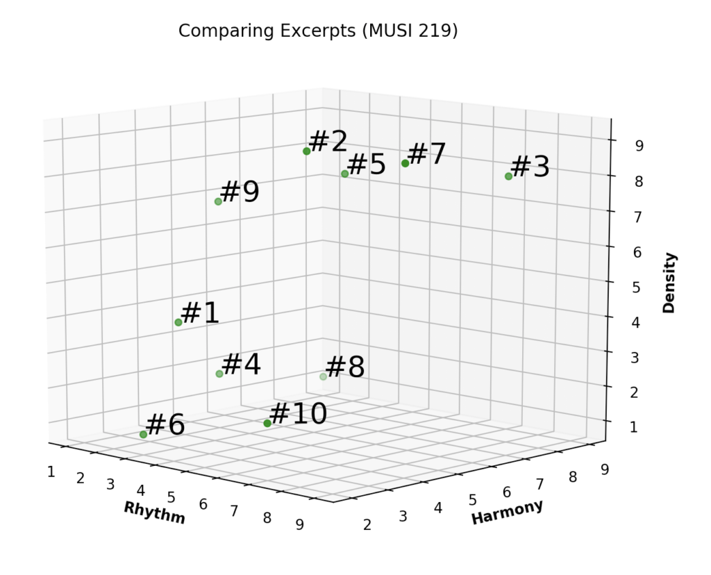
Next, the students rank the examples according to musical qualities. These can be predetermined, but I find it best to involve the students in choosing the specific qualities. Qualities must be measurable on a continuum—not binary categorizations. For example, the sense of whether an example has a beat or not, where 1 is no beat and 10 is a very clear beat. Example criteria that students have come up with in my classes include harmony, density, naturalness, and electronicness.
I like to have the students brainstorm many different possible qualities, then have a class discussion where we narrow it down to just a handful. I prefer three qualities since that can easily be graphed on three-dimensional axes. Usually I’ll have the students complete their rankings at home between class sessions, and in the next class, students compare their rankings with a partner—and revise them if desired. (I will often play a short excerpt of each example as a reminder to spur discussion.) Before jumping into the results, I also always like to see if there are major discrepancies in how different students interpreted different qualities, and discuss how they might have come about.
Finally, I’ll collect students’ rankings electronically, using Google Forms, Zoom, or some other tool. I input them into Excel to quickly get average rankings, and the average rankings are what I end up inputting into Python to plot.
The idea behind visualizing the results is to spur a discussion along two lines: (1) how certain musical qualities can be shared between stylistically different examples, and (2) how perception of the qualities of a given example can vary significantly between individuals. I often begin by focusing on examples that are located close to one another in the space, which I refer to as clusters. I follow up by asking what accounts for the similarities that can be seen.
Other questions include asking whether there are any examples that are close together but don’t seem to sound similar, or examples that do sound similar (at least to some), but are far away in the space. If we find instances such as this, I ask students what might account for these seeming disparities. I also ask if any of the clusters we identify might correspond with familiar or recognized genres. And finally, I ask students how hypothetical changes to our criteria—or different criteria altogether—might modify the space.
Here is a simple version of the Python code I use:
from mpl_toolkits import mplot3d
import numpy as np
import matplotlib.pyplot as plt

rhythm, harmony, density = [], [], []

for i in range(10):
 j = i + 1
 k = 'Rhythm Value for Excerpt #' + str(j) + ': '
 element = int(input(k))
 rhythm.append(element)

for i in range(10):
 j = i + 1
 k = 'Harmony Value for Excerpt #' + str(j) + ': '
 element = int(input(k))
 harmony.append(element)

for i in range(10):
 j = i + 1
 k = 'Density Value for Excerpt #' + str(j) + ': '
 element = int(input(k))
 density.append(element)

fig = plt.figure()
ax = plt.axes(projection ="3d")

ax.scatter3D(rhythm, harmony, density, color = "green")
plt.title("Genre Graph Activity")
ax.set_xlabel('Rhythm', fontweight ='bold')
ax.set_ylabel('Harmony', fontweight ='bold')
ax.set_zlabel('Density', fontweight ='bold')

point_labels = ['#1', '#2', '#3', '#4', '#5', '#6', '#7', '#8', '#9', '#10']

for n in range(10):
 ax.text(rhythm[n],harmony[n],density[n], point_labels[n], size=20, zorder=1)

plt.show()
You can run it in any IDE or through the Terminal on Mac and input the requested values, modifying the names of the parameters as you see fit. In the next post, I will go through the code in more detail, make it more robust and generalizable, and explore customizing the visualizations. I’ll also use a sample data set to illustrate the discussion.